For Dartmouth’s 250th anniversary, Associate Professor Mikhail Gronas wanted a new way for people to engage with the College’s art. His idea was to give artworks something like footnotes: notes attached to specific details that a viewer can open, the way a reader opens a footnote in a book.
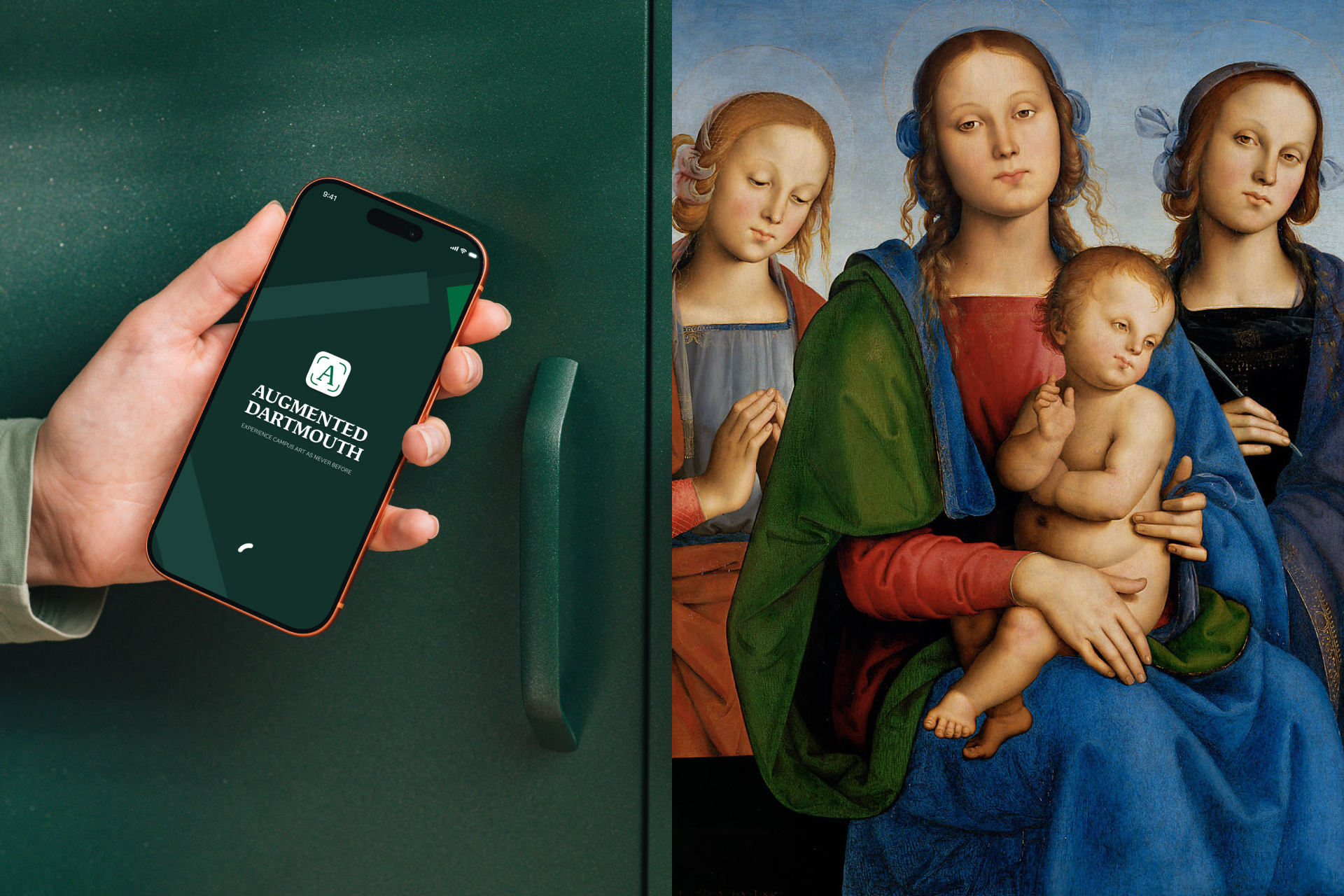
The first release focused on two of Dartmouth’s most important works. The first is José Clemente Orozco’s The Epic of American Civilization murals in Baker-Berry Library. The second is Perugino’s Virgin and Child with Saints at the Hood Museum of Art.

The project had three sets of needs.
For visitors, these artworks are dense with meaning, but a wall label can only say so much. Most details, symbols and historical references go unnoticed unless a professor is there to point them out.
For faculty and curators, the content would keep growing and changing. Students were writing and researching it throughout the project, and it had to be editable without a developer every time a sentence changed.
For the institution, this needed to be a lasting platform rather than a one-off anniversary gimmick. The team wanted it to scale to more artworks on campus and eventually to other museums.
There was also healthy skepticism to design for. Much of museum AR at the time was spectacle, such as making paintings move or placing visitors next to dinosaurs. The art historians were not interested in that. The product had to earn its place by serving the art, not distracting from it.
Who We Designed For
- Students and campus visitors exploring the murals and the museum, often with no background in art history.
- Alumni and guests at Homecoming, where the app launched. They were first-time users with no onboarding time.
- Faculty and student researchers who write and maintain the content. For them the product is the CMS, not the app.
Design Principles
- Content over spectacle. AR is the way in, and the story is the point. Every interaction had to lead the user toward understanding the artwork.
- Overview before detail. Users need to understand the whole work before its fragments make sense.
- Zero learning curve. Point the phone at the artwork and the next step should be obvious.
- Built to outlast the launch. Adding a new artwork should require a curator, not a developer.
Process
1. Discovery
I worked closely with the faculty team to understand how they already teach these works: how a guided tour moves through the space, which details they always point out, and which questions students ask most often.
2. Information Architecture
The key decision was one content model shared by the app and the CMS:
Collection → Artwork → Hotspot → Note (text, images, and later video)
Because both sides used the same structure, anything a curator created in the CMS appeared in the app exactly as intended, with no translation layer and no custom work per artwork.
3. Core Experience
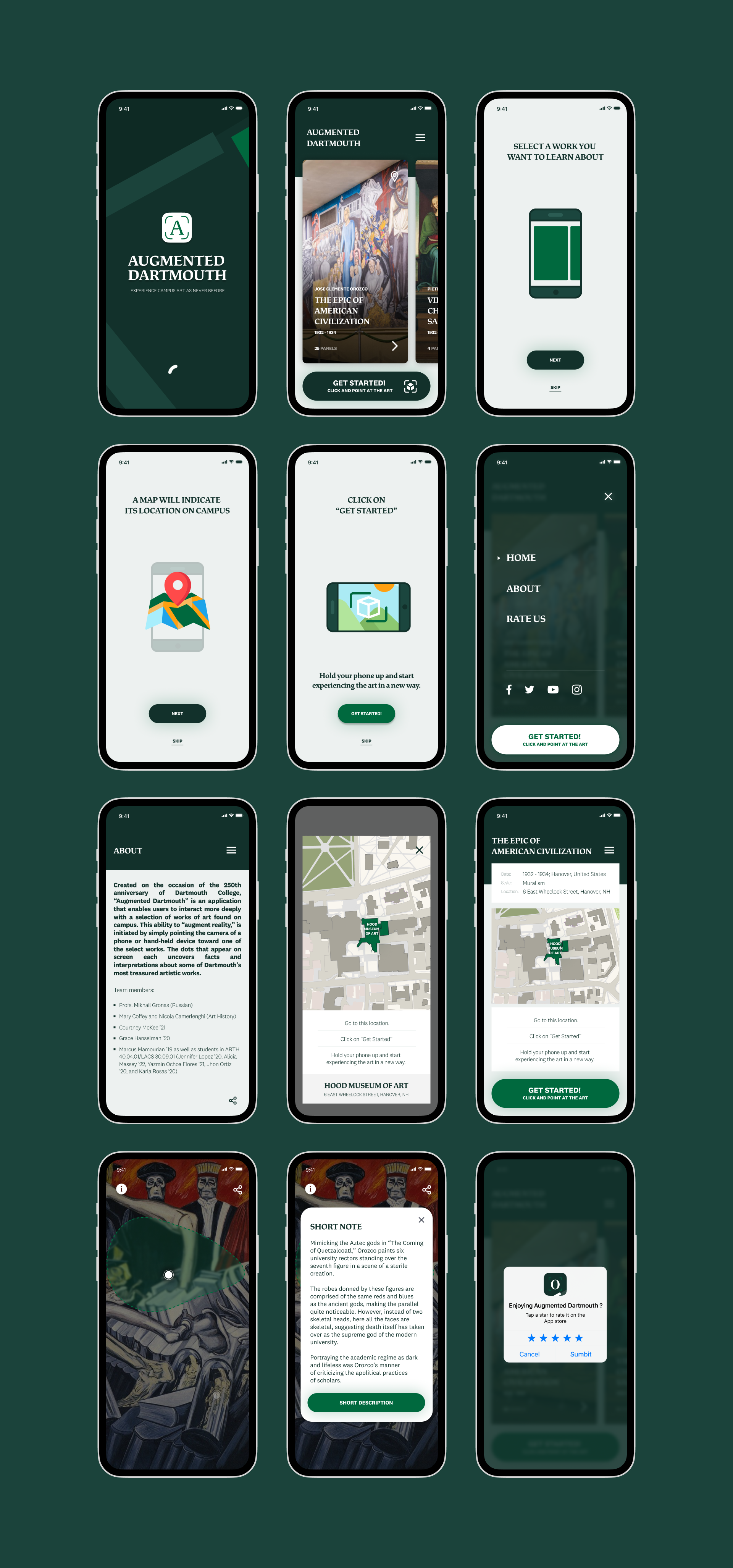
The main interaction works like Pokémon Go:
- The user points the phone at the artwork.
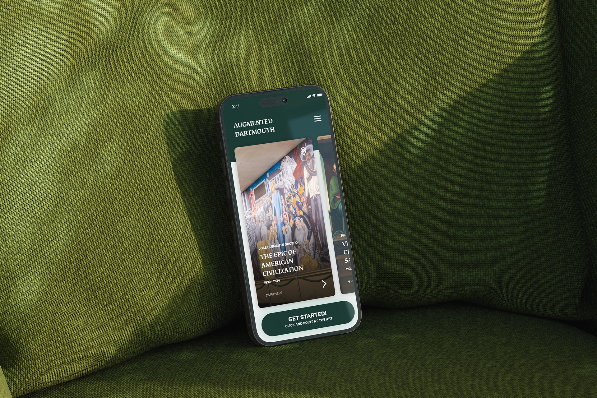
- The app recognizes it and shows interactive points anchored to specific details.
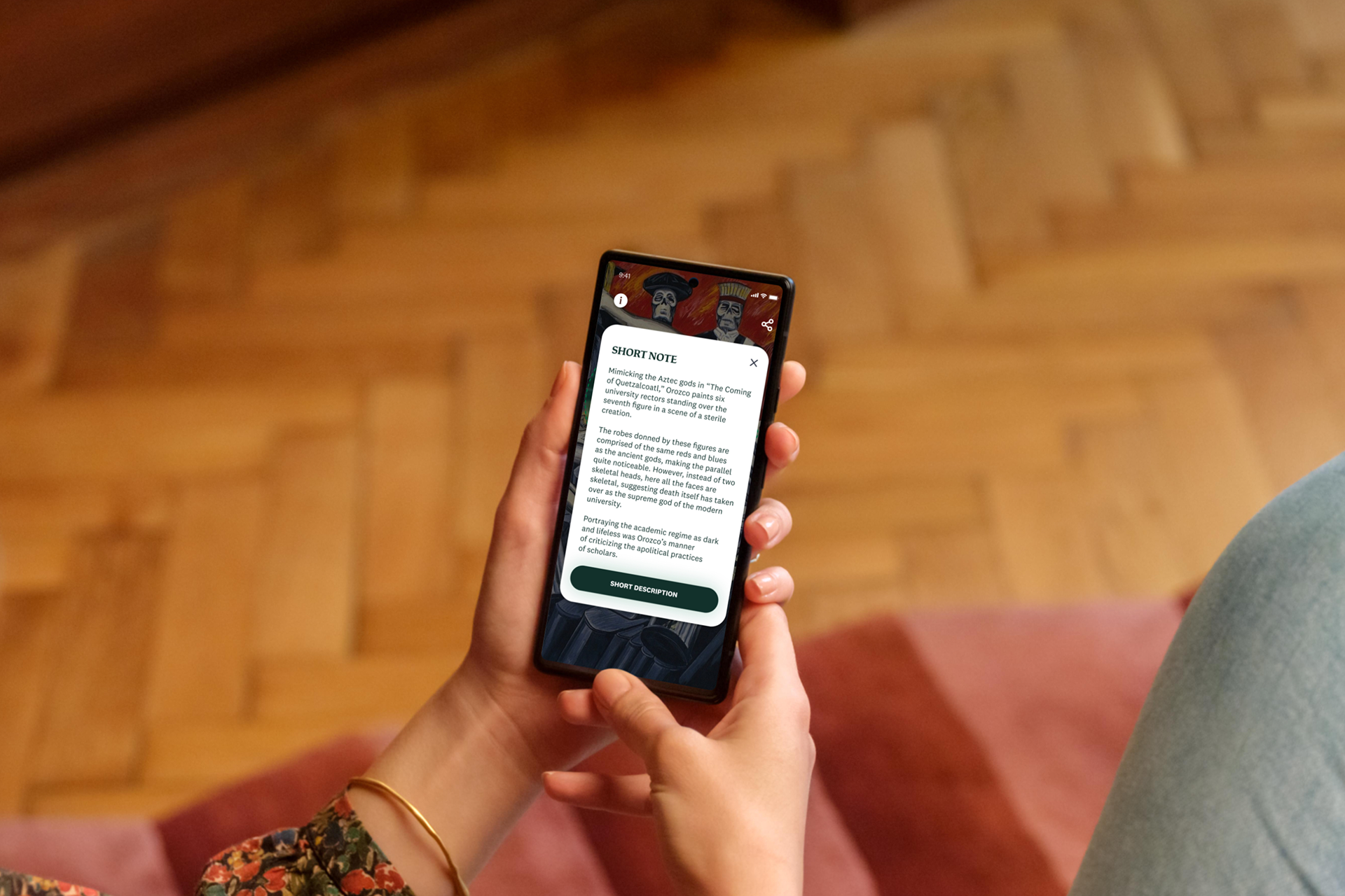
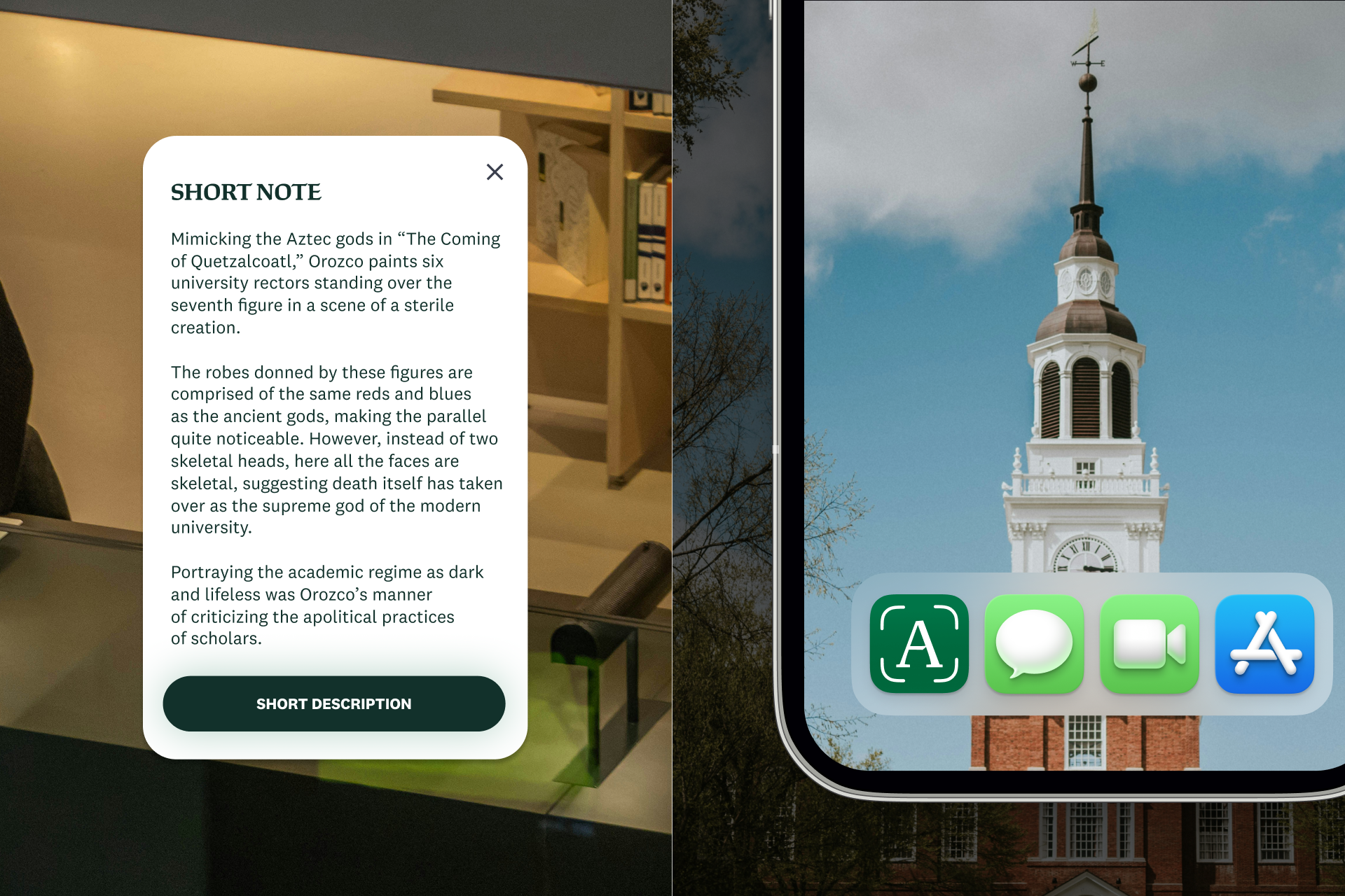
- Tapping a point opens a note with the story behind that detail, such as the white-robed figure of Quetzalcoatl in the Orozco murals or one of the saints in the Perugino.
- The user closes the note and continues exploring.
The hardest UX question came from the content team: where does the user learn about the panel as a whole before diving into details? A book has chapters and a tour has a route, but AR has neither. This gave the experience a narrative structure without forcing a fixed path.
Content Platform
To keep the project alive after launch, I designed and built a custom WordPress-based content management system. Curators and student researchers can:
- create collections and add artworks
- place hotspots by clicking directly on an image of the artwork
- attach text, images and educational annotations to each hotspot
- update any content at any time, without touching code
The mobile app pulls collections, artworks, hotspot positions and notes from this platform through the WordPress REST API. New content therefore appears in the app without releasing an app update.

Outcome
Augmented Dartmouth launched on the App Store and Google Play in time for Homecoming 2019, as part of Dartmouth’s 250th anniversary celebrations.
- 1,000+ downloads
- 500+ new users
- 300+ students engaged
The project turned into a real collaboration with students. Students in Prof. Coffey’s Mexican Muralism class wrote the first texts for the Orozco murals, and other students researched, tested and proofread content, all working directly in the CMS.
The project was supported by the 250th Anniversary Committee, the Hood Museum of Art, the Leslie Center for the Humanities, the Dartmouth Center for the Advancement of Learning, and the Kress Foundation. Dartmouth News covered the launch.
Have a project in mind?
I’d be happy to hear what you’re working on.